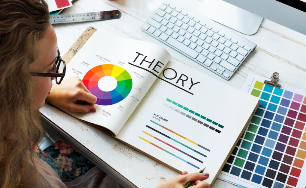
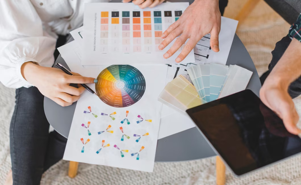
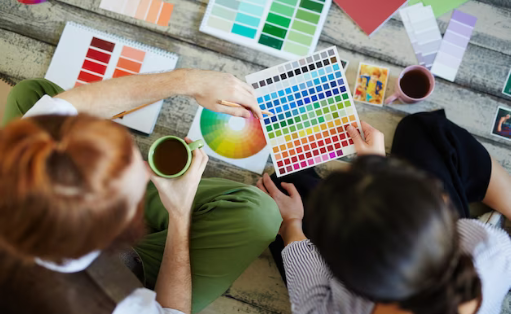
The Psychology of Colors in Design – The way we see and engage with the world around us may be influenced by colors. They go beyond simple aesthetic considerations. We go into the fascinating field of color psychology in design in this extensive examination to learn how colors affect our feelings and perceptions.
The Colors We Choose: An Emotional Symphony

Colors have a remarkable capacity to arouse feelings, bring back memories, and affect our behavior’s. Understanding the psychology of color selections is crucial for designers who want to create experiences that appeal to their target market.
Red: Passion and Power
Red is a color that commands attention. It is linked to fervor, affection, and vigor. Red is a common color choice for calls to action and alarms in design because it may evoke feelings of excitement and urgency.
Blue: Trust and Tranquility
Blue exudes trustworthiness and calm. It’s often used in corporate branding to convey reliability and professionalism. Lighter blues can evoke a sense of tranquility, while deeper blues exude confidence.
Green: Growth and Balance
Green represents nature, growth, and balance. It’s frequently employed in industries related to health, sustainability, and the environment. Green can convey a sense of harmony and rejuvenation.
Yellow: Optimism and Warmth
Yellow radiates optimism and warmth. It’s an attention-grabbing color that can evoke feelings of happiness and cheerfulness. In design, yellow is often used to draw the eye to key elements.
Purple: Royalty and Luxury
Purple is associated with luxury, royalty, and creativity. It’s a color that can spark imagination and convey a sense of elegance. In branding, purple is often used to suggest sophistication.
Orange: Energy and Vitality
Orange is a vibrant color that exudes energy and vitality. It’s often used to create a sense of enthusiasm and excitement. In design, orange can add a playful and adventurous element.
A Complete Guide to Color Design

1. Understanding Color Associations
Begin by familiarizing yourself with the emotional associations linked to various colors. Understand that these associations can vary across cultures, so it’s crucial to consider your target audience.
2. Color Harmonies
Learn about color harmonies, such as complementary, analogous, and triadic color schemes. These harmonies can guide your color choices to create visually pleasing and harmonious designs.
3. Cultural Sensitivity
Consider cultural implications when choosing colors. What may symbolize luck or happiness in one culture might have entirely different connotations in another. Research is key.
4. The Impact of Color Intensity
The intensity or saturation of a color can greatly influence its emotional impact. Bright, vibrant colors may elicit stronger emotions, while muted tones can evoke subtler feelings.
5. Accessibility
Remember that colour choices should also consider accessibility. Ensure that your designs are readable and usable by individuals with color vision deficiencies.
Q&A: Unveiling the Mysteries of Color Psychology

Q1: Can color choices impact website conversion rates?
A1: Absolutely. The right color choices can influence user behavior. For instance, a well-placed call-to-action button in a contrasting color can increase click-through rates.
Q2: Are there universal color meanings?
A2: While some color meanings are relatively universal (e.g., red for danger), many are culturally influenced. It’s essential to consider the context and audience.
Q3: How can I use color to create a specific mood in my design?
A3: Start by identifying the mood you want to convey. For instance, warm colors like red and orange can create excitement, while cool colors like blue and green evoke calmness.
Principles for Color Design

As you embark on your journey into the world of color psychology in design, keep these precautions in mind:
1. Overuse of Vibrant Colors: Using too many vibrant colors can overwhelm users. Balance vibrant colors with neutral tones for a more harmonious design.
2. Lack of Testing: Always test your color choices with your target audience. What looks good to you may not resonate with your users.
3. Ignoring Accessibility: Ensure your design is accessible to all users, including those with color vision deficiencies. Use color contrast tools to check readability.
4. Neglecting Cultural Significance: Be mindful of cultural differences when using colors. Research the cultural significance of colors in your target markets.
In conclusion, the psychology of colors in design is a fascinating journey that unveils the profound impact of color choices on user perceptions and emotions. As designers, we hold the power to evoke specific feelings and behaviors through our color selections. By understanding the nuances of color psychology and considering the context, audience, and cultural influences, we can create designs that resonate deeply and leave a lasting impression.


